


01
Legacy tools, unclear needs
Outdated tools made it hard to tell what users actually used — or needed on screen
02
Adapted to friction
Clunky tools bred errors — users made it work, but lost speed and precision
03
Early AI skepticism
First versions triggered scepticism — users didn’t trust or understand the decisions
04
Fast scans & deep dives
With most tasks automated, UI had to support both quick scans and deep dives
05
Simplicity vs. credibility
The product had to look modern — but instantly signal credibility and precision
06
Designing across time zones
Split time zones with ops, design, and AI teams slowed feedback and blurred alignment
01
User interviews & audits
Spoke with mortgage experts and underwriters to clarify needs and cut legacy noise
02
Familiar patterns, clearer UI
Kept spreadsheet patterns for ease — improved structure, clarity, and trust
03
Explainable AI
Broke down decisions, linked sources, and added human review control
04
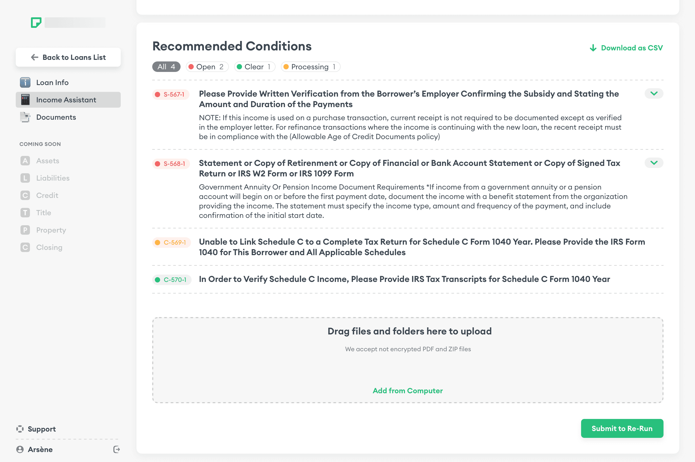
Progressive disclosure
Summaries on top, full application data and decision logic a click away
05
Trustworthy visual tone
Calm colours and sharp structure — trust without saying a word
06
Async team workflow
Reframed workflow: async Miro updates, morning design blocks, evening syncs


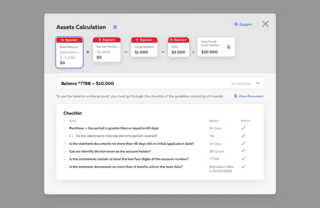


We went through dozens of design iterations to find patterns that worked best for speed, clarity, and trust.

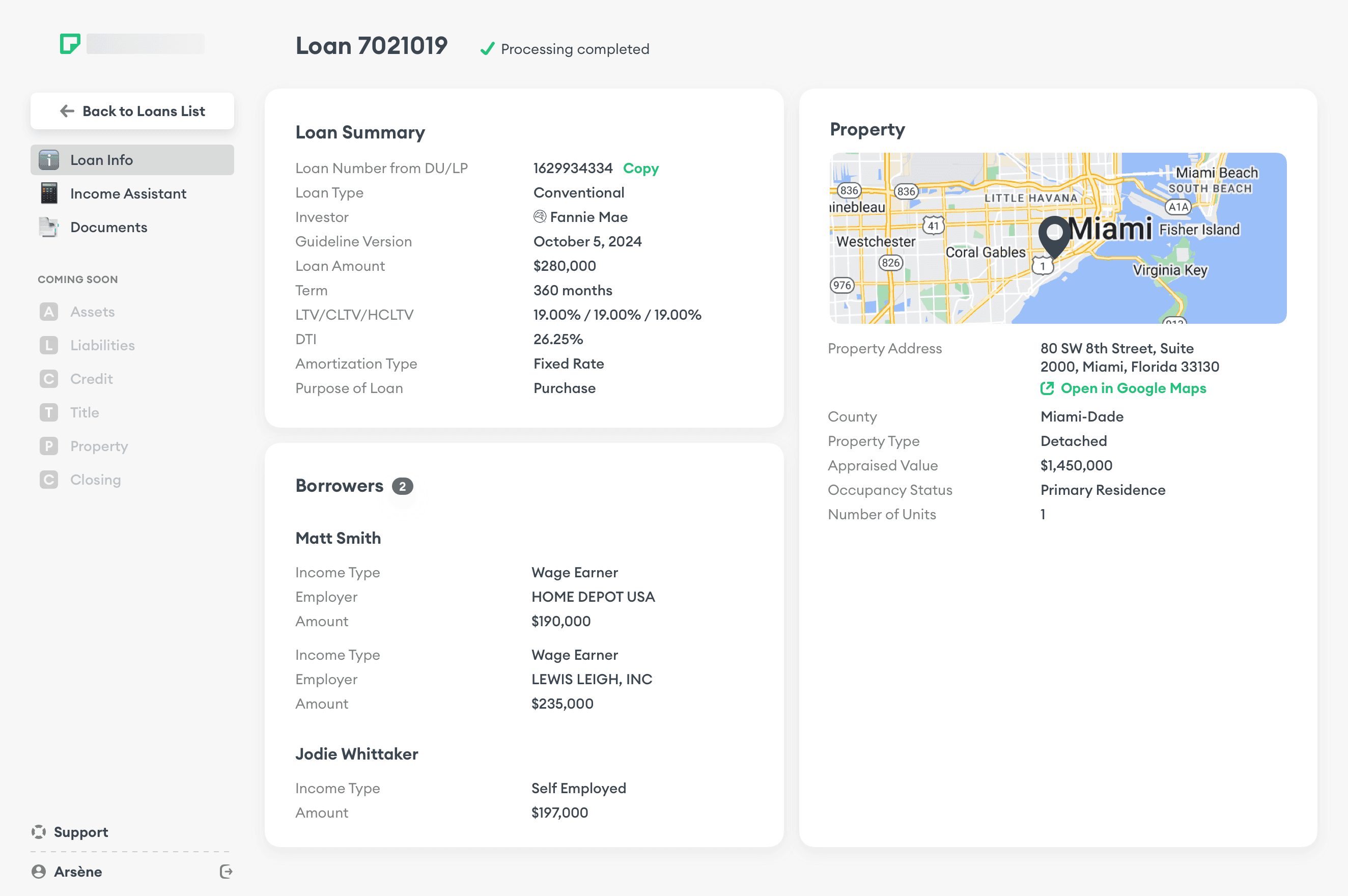
Final Design in Action
A minimalist interface that balances trust, familiarity, and innovation — with clear typography, whitespace, and hierarchy.


Micro-Optimisations


More Screens


Brand Identity


Presentations


Up Next
View the Project
